Button是一个常用控件,有很多和wpf一样,可以看《深入浅出WPF》,但还有一些虽然常用,但是可能大家不知道的功能
Button常用的就是点击
我们可以在button的click写上
<Button Content="确定" Click="Button_Click"/>在Button_Click按F12到代码写上点击按钮需要运行
private void Button_Click(object sender, RoutedEventArgs e) { //这里写上点击按钮后触发 }除了写在xaml.cs也可以写在ViewModel,ViewModel的写法很简单,我们需要在ViewModel建立一个方法,这个方法的参数为void或object sender, RoutedEventArgs e
假如viewModel有一个方法 ce
在Button可以在Click写
Click="{x:Bind view.ce}"原来的WPF使用的是Command,实在不好看,用了UWP我都不在WPF写Command
在用ViewModel需要在MainPage.xaml.cs写
viewModel view {set;get;}= new viewModel();内容
button content可以使用一个元素,这个元素可以是Grid,我们可以做一个圆形头像
先找出一张图,我们把这张图做头像
把图放到项目
<Button Height="100" Width="100" Margin="10,10,10,10" Padding="0" Foreground="{x:Null}" BorderBrush="{x:Null}" Background="{x:Null}"> <Button.Content> <Ellipse Margin="0,0,0,0" Height="90" Width="90"> <Ellipse.Fill> <ImageBrush ImageSource="Assets/20151226160608688.jpg" /> </Ellipse.Fill> </Ellipse> </Button.Content> </Button>注意,放在项目的图片,不是这么简单,具体如何使用,参见 win10 uwp 访问解决方案文件
修改鼠标在按钮上的样子
我们可以修改鼠标在按钮上的样子
button可以设置属性,使用资源 资源可以写在页面
    <Page.Resources>
    </Page.Resources>
所有按钮使用同样式
    <Page.Resources>        <Style TargetType="Button">
</Style> </Page.Resources>按钮的属性用<Setter Property="属性" Value="值"/>
按钮的背景
<Page.Resources> <Style TargetType="Button"> <Setter Property="Background" Value="White"/> </Style> </Page.Resources>指定一个样式,key
<Page.Resources> <Style TargetType="Button"> <Setter Property="Background" Value="White"/> <Setter Property="Width" Value="100"/> <Setter Property="Height" Value="100"/> </Style> <Style x:Key="button" TargetType="Button"> <Setter Property="Background" Value="White"/> <Setter Property="Width" Value="50"/> <Setter Property="Height" Value="50"/> </Style> </Page.Resources> <Button Content="默认"/> <Button Style="{StaticResource button}" Content="确定"/>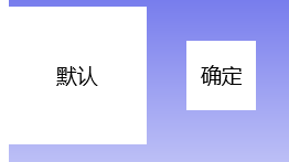
在设计,点按钮,右击,编辑模板副本,选择当前页
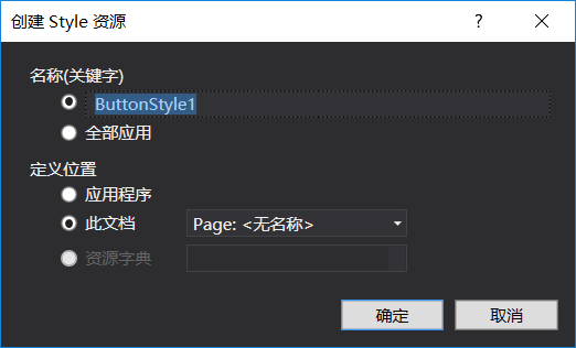
可以看到
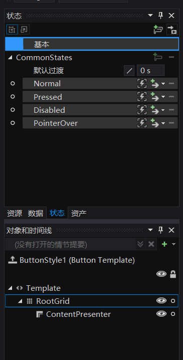
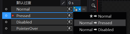
<Page.Resources> <Style x:Key="ButtonStyle1" TargetType="Button"> <Setter Property="Background" Value="{ThemeResource SystemControlBackgroundBaseLowBrush}"/> <Setter Property="Foreground" Value="{ThemeResource SystemControlForegroundBaseHighBrush}"/> <Setter Property="BorderBrush" Value="{ThemeResource SystemControlForegroundTransparentBrush}"/> <Setter Property="BorderThickness" Value="{ThemeResource ButtonBorderThemeThickness}"/> <Setter Property="Padding" Value="8,4,8,4"/> <Setter Property="HorizontalAlignment" Value="Left"/> <Setter Property="VerticalAlignment" Value="Center"/> <Setter Property="FontFamily" Value="{ThemeResource ContentControlThemeFontFamily}"/> <Setter Property="FontWeight" Value="Normal"/> <Setter Property="FontSize" Value="{ThemeResource ControlContentThemeFontSize}"/> <Setter Property="UseSystemFocusVisuals" Value="True"/> <Setter Property="Template"> <Setter.Value> <ControlTemplate TargetType="Button"> <Grid x:Name="RootGrid" Background="{TemplateBinding Background}"> <VisualStateManager.VisualStateGroups> <VisualStateGroup x:Name="CommonStates"> <VisualState x:Name="Normal"> <Storyboard> <PointerUpThemeAnimation Storyboard.TargetName="RootGrid"/> </Storyboard> </VisualState> <VisualState x:Name="PointerOver"> <Storyboard> <ObjectAnimationUsingKeyFrames Storyboard.TargetProperty="BorderBrush" Storyboard.TargetName="ContentPresenter"> <DiscreteObjectKeyFrame KeyTime="0" Value="{ThemeResource SystemControlHighlightBaseMediumLowBrush}"/> </ObjectAnimationUsingKeyFrames> <ObjectAnimationUsingKeyFrames Storyboard.TargetProperty="Foreground" Storyboard.TargetName="ContentPresenter"> <DiscreteObjectKeyFrame KeyTime="0" Value="{ThemeResource SystemControlHighlightBaseHighBrush}"/> </ObjectAnimationUsingKeyFrames> <PointerUpThemeAnimation Storyboard.TargetName="RootGrid"/> </Storyboard> </VisualState> <VisualState x:Name="Pressed"> <Storyboard> <ObjectAnimationUsingKeyFrames Storyboard.TargetProperty="Background" Storyboard.TargetName="RootGrid"> <DiscreteObjectKeyFrame KeyTime="0" Value="{ThemeResource SystemControlBackgroundBaseMediumLowBrush}"/> </ObjectAnimationUsingKeyFrames> <ObjectAnimationUsingKeyFrames Storyboard.TargetProperty="BorderBrush" Storyboard.TargetName="ContentPresenter"> <DiscreteObjectKeyFrame KeyTime="0" Value="{ThemeResource SystemControlHighlightTransparentBrush}"/> </ObjectAnimationUsingKeyFrames> <ObjectAnimationUsingKeyFrames Storyboard.TargetProperty="Foreground" Storyboard.TargetName="ContentPresenter"> <DiscreteObjectKeyFrame KeyTime="0" Value="{ThemeResource SystemControlHighlightBaseHighBrush}"/> </ObjectAnimationUsingKeyFrames> <PointerDownThemeAnimation Storyboard.TargetName="RootGrid"/> </Storyboard> </VisualState> <VisualState x:Name="Disabled"> <Storyboard> <ObjectAnimationUsingKeyFrames Storyboard.TargetProperty="Background" Storyboard.TargetName="RootGrid"> <DiscreteObjectKeyFrame KeyTime="0" Value="{ThemeResource SystemControlBackgroundBaseLowBrush}"/> </ObjectAnimationUsingKeyFrames> <ObjectAnimationUsingKeyFrames Storyboard.TargetProperty="Foreground" Storyboard.TargetName="ContentPresenter"> <DiscreteObjectKeyFrame KeyTime="0" Value="{ThemeResource SystemControlDisabledBaseLowBrush}"/> </ObjectAnimationUsingKeyFrames> <ObjectAnimationUsingKeyFrames Storyboard.TargetProperty="BorderBrush" Storyboard.TargetName="ContentPresenter"> <DiscreteObjectKeyFrame KeyTime="0" Value="{ThemeResource SystemControlDisabledTransparentBrush}"/> </ObjectAnimationUsingKeyFrames> </Storyboard> </VisualState> </VisualStateGroup> </VisualStateManager.VisualStateGroups> <ContentPresenter x:Name="ContentPresenter" AutomationProperties.AccessibilityView="Raw" BorderBrush="{TemplateBinding BorderBrush}" BorderThickness="{TemplateBinding BorderThickness}" ContentTemplate="{TemplateBinding ContentTemplate}" ContentTransitions="{TemplateBinding ContentTransitions}" Content="{TemplateBinding Content}" HorizontalContentAlignment="{TemplateBinding HorizontalContentAlignment}" Padding="{TemplateBinding Padding}" VerticalContentAlignment="{TemplateBinding VerticalContentAlignment}"/> </Grid> </ControlTemplate> </Setter.Value> </Setter> </Style> </Page.Resources>在<VisualState x:Name="Pressed">可以把里面写成这个状态的样子,按钮有正常,按下,鼠标在按钮上,可以对每个修改
点击Pressed更改pressed
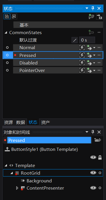
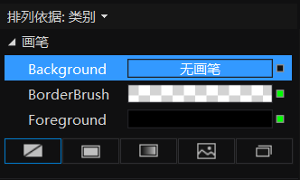
看到这里按钮有背景

去掉背景,按F4把背景无画笔
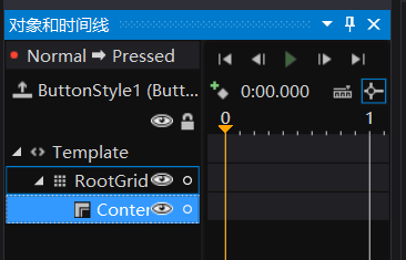
添加过度
记录关键帧
选时间0.5改变背景
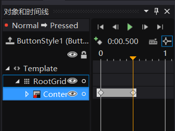
选时间,改变背景
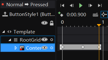
点播放可以看到我们做出来的按钮,可以运行。移动到button显示文字
在装机必备移动到搜狐显示搜狐,具体代码 参考:http://blog.csdn.net/lindexi_gd/article/details/50166161
<Button Click="souhu_Click" ToolTipService.ToolTip="搜狐视频" Padding="0" > <Button.Content> <Grid> <Grid.RowDefinitions> <RowDefinition Height="auto"/> <RowDefinition Height="auto"/> </Grid.RowDefinitions> <Image Source="ms-appx:///Assets/搜狐.png" Grid.Row="0" ScrollViewer.VerticalScrollBarVisibility="Disabled" /> <TextBlock Text="搜狐视频" Grid.Row="1" HorizontalAlignment="Center" /> </Grid> </Button.Content> </Button>
显示图片
<Button Click="souhu_Click" Padding="0" > <Button.Content> <Grid> <Grid.RowDefinitions> <RowDefinition Height="auto"/> <RowDefinition Height="auto"/> </Grid.RowDefinitions> <Image Source="ms-appx:///Assets/搜狐.png" Grid.Row="0" ScrollViewer.VerticalScrollBarVisibility="Disabled" /> <TextBlock Text="搜狐视频" Grid.Row="1" HorizontalAlignment="Center" /> </Grid> </Button.Content> <ToolTipService.ToolTip> <Image Height="50" Width="50" Source="ms-appx:///Assets/搜狐.png"/> </ToolTipService.ToolTip> </Button>圆角按钮
参见:圆角按钮
点击进度条按钮

https://github.com/lindexi/uwp/tree/master/uwp/control/Button
大神写的按钮

原文链接: http://blog.lindexi.com/post/win10-UWP-button
本作品采用 知识共享署名-非商业性使用-相同方式共享 4.0 国际许可协议 进行许可。 欢迎转载、使用、重新发布,但务必保留文章署名 林德熙 (包含链接: https://blog.lindexi.com ),不得用于商业目的,基于本文修改后的作品务必以相同的许可发布。如有任何疑问,请与我 联系。